Submitted by Philip Storry on
Some may have noticed that my little corner of the internet has become more individual.
And for those of you who aren't British, "individual" is our polite way of saying "ugly".
Him: "What do you think of my new tie?"
Her: "Very individual, dear... "
Why does my website now have an "individual appearance"? Typography.
All I've done is change the typography of the website. And my only regret is that I didn't take a "before" screenshot to put here...
Like most people who like typography, I have a decent selection of typefaces I can use on my computer at home. But until recently, there's been no way to get a web page to display in typefaces that aren't already installed on the viewing machine.
I want to talk about the selections I made, and why I made them.
The body text
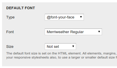
The body text is the most important text on a website. I wanted something to make it easy to read - something that slipped past the eye with little strain. So I thought about my experiences with e-Readers, and remembered that the most pleasant experience I'd had there was in Google Play Books on my phone/tablet. Two fonts there had caught my eye, and a little experimentation made me settle on Merriweather, specifically Merriweather Regular:
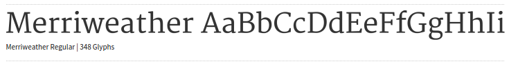
It's a nicely rounded serif font, which looks good on screen. I particularly like the curves on the top of the letters - I suspect that they're a good aid in letting your eye get the outline of a word quickly, which is why it helps readability.
Headings
I tried quite a few fonts for headings. Quite a few indeed. Monospaced ones, a variety of sans serif fonts - but in the end, I went with Vollkorn. Depending on the exact context, either the Regular, Bold or Italic face is used.
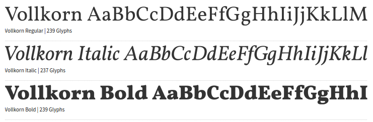
Now, I know some people have been told that headings should be in a sans serif typeface. Well, I tried that, and I didn't like it. My website, my rules.
I think on a screen, the contrast between the two typefaces - combined with the difference in sizes - means that spotting a heading is pretty easy. So I wanted a distinctive theme, that presented a very distinctive, yet familiar feel. I would say bold or daring - it felt that way at first - but in the end, I think Vollkorn is actually a rather restrained choice. It reminds me of the kind of type you'd see on a drinks label in the 1950's, so it has a certain traditional reminiscence to it.
Vollkorn was another font I found in the Google Play Books e-Reader app, and I did try it out for the body text, but preferred Merriweather. It was when looking at larger sizes that I suddenly realised it might provide a decent counterpoint to the body text.
Menus and block headings
I wanted the eye to skip over these after you first read them, so I picked a monospaced serif font - Adobe's Source Code Pro.
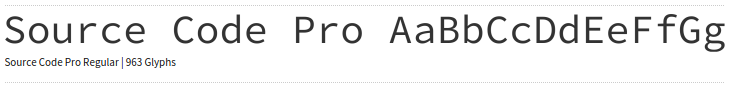
I personally don't find the switch to this typeface difficult, as I'm focused on the body. My tweaks to the website design have given a much wider main body area, which draws the eye - so on many screens you barely see this typeface until you go to look for a menu of some kind. At that point, the sudden switch makes it pretty obvious which areas of the screen are functional and which are content.
Block content
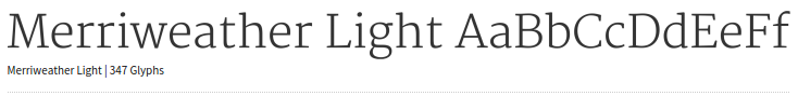
I use blocks to help navigate the website. If you go into the Reviews, you get a new block of text to help you navigate them - either at the right (on a large screen) or below (on a small screen). That block gets a lot of text, so I wanted to reduce the impact of it and make it clear that it wasn't important. It's still Merriweather, but it's the light variant - and about 0.2em smaller than the main body text, so that you don't confuse it for the body text.
The (not so) dense technical stuff
Of course, I'm not a web designer - so how the hell am I doing all of this?
The Drupal module
The fonts themselves come from projects like Adobe Edge Web Fonts, Google Fonts and Fontsquirrel.
There's a little more to it, but not much.
I've tested this solution on a variety of tablets, phones and with two main browsers (Chrome and Firefox). It looks good to my eye in those tests.
(I'm well aware that this isn't a perfect technical solution. There are no fallback fonts specified, so if the fonts can't be downloaded you'll just get the browser defaults. Or, in Safari's case, nothing at all, because Safari has some deep flaws in webfont handling. And I haven't tested with IE because IE is still the worst browser out there. Years ago, I'd care deeply about that kind of stuff. Now, I have things to do, so have decided to code for the future rather than for the past. Browsers will catch up in time...)
Conclusion
It's important to note that there may well be some minor tweaks in future, but I'm posting this now because I think this is the basis for the typography I'll be using on this website for at least the next year or so.
I like the way my website looks now. It's not perfect, but it is distinctive. It's definitely my website, as opposed to just "another website using style #247", and all it took was a little typographical jiggery-pokery.